Design Considerations
Elements of your poster
Finally we get to the design of the actual poster.
Select the features to the right to learn how to greatly improve the readability of your poster :
:
1. Color
Create a color palette of 2-3 complementing and contrasting colors. It may be worth while to use your school colors.
Color palettes can be based on included images, too. Eye-pleasing palettes can be created using free tools:
2. Fonts
Font sizing helps create a visual order in your poster. Any text of the same magnitude should be sized the same. For example the sub-headers would be sized about 40pt. The headers should be 90-150pt.
It is important to choose an easy-to-read font style for your poster. Avoid using more than two fonts.
3. Focus and Flow
Arrange information strategically to lead the reader through the profess of your research. Identify your main message and position it prominently so your audience notices it first.
Content can be arranged in various ways including columns, in a circle or like a flow chart.

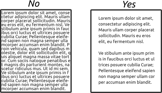
4. White Space
Crowding your content makes it difficult to read. At least 1/3 of your poster should be white space.
5. Images
Use the largest size you can and scale it down to fit your poster. Never scale an image up. Images lose quality when you make them larger.


6. Alternatives to Text
Posters are a visual medium. Find visual ways to represent your information.

7. Graphs
Use Excel or another program to create visually engaging graphs. You will have more control and these programs have more robust charting tools.
 All axis labels should be legible.
Use complimentary colors.